5 Bias and equity: the proxy problem
About 75 minutes
- The idea. Many algorithms measure something easy in place of the thing that matters, and the stand-in can work worse for some groups of patients. You can now ask of any tool, “What does it measure, and what is that standing in for?”, and say whether you could catch a failure at the bedside.
- What you do. Ask ChatGPT Edu for three algorithms in your specialty where what is measured differs from what matters, then confirm one paper in PubMed.
- What you keep. One row for your specialty: what mattered, what stood in for it, who was harmed, and whether the fix is in use. And the one question you will ask about every new algorithm.
- Short on time? Read “The number on the monitor”, “Case two: cost standing in for need”, and “The study that complicates the bedside answer”. Do Part B.
By the end of this chapter you will be able to:
- State the proxy problem in one sentence. Then, for an algorithm you have never seen before, name the thing it measures in place of the thing that matters.
- Explain the Obermeyer study step by step: what the model was built to predict, the harm that caused, and the fix, including how big the fix was.
- For a case in your specialty, name the stand-in or the data gap, the group harmed and the decision that went differently for them, the fix that followed, and whether that fix is in use today. “Still draft” or “still contested” can be the honest answer.
- Tell apart two kinds of harm (allocation and representation) and two kinds of bias (statistical and social).
- Say what a clinician can and cannot catch at the bedside without seeing inside a model. Cite the evidence that clinicians do not reliably catch a biased model, even when the model explains itself.
Course competency: AIM-3 (bias and equity).
What you need. Your university ChatGPT Edu or Copilot account, and a PubMed tab. Nothing to install. Made-up patients only. The time is about 20 minutes of reading, 45 of doing, and 10 for the check and the closing question. The podcast is an extra 25 minutes if you want it.
5.1 The number on the monitor
It is 3 a.m. on your sub-internship and you are cross-covering a medicine floor. A nurse calls about a 61-year-old man admitted with pneumonia. He is breathing faster than he was at midnight. He is using his neck muscles. He has stopped finishing his sentences. You go and look. He is a Black man with dark skin, sweating, leaning forward on the bed. The monitor says his oxygen saturation is 94 percent on two liters.
Ninety-four is a number that lets you go back to bed. The patient in front of you is not. You have a choice: believe the number, or believe the man. You draw an arterial blood gas. The saturation measured directly from his blood comes back at 86 percent.
The pulse oximeter was not broken. It was doing what it was designed to do. It shines red and infrared light through a fingertip and measures how much of each comes out the other side. It then converts that into a saturation using a conversion curve built by testing volunteers. Most of the volunteers had light skin. Skin pigment absorbs some of the light too, and the device cannot tell pigment from hemoglobin. For this man, at this saturation, the number on the monitor was eight points too high.
Nobody in the room, including the patient, knew that the device had been calibrated on people who did not look like him. Remember that. The chapter comes back to it.
5.2 Why this matters
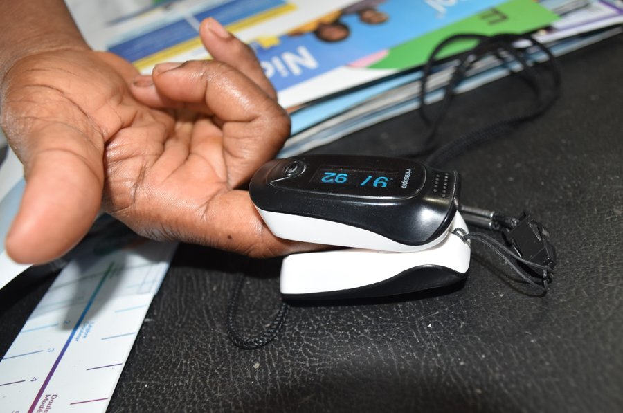

In your first month of residency you will act on the output of many algorithms. Nobody will call them algorithms. They include the pulse oximeter, the estimated kidney function on the lab report, the sepsis alert, the risk score that decides who gets a care coordinator, and the reference range on a spirometry printout. Most of them work. Several are known to work worse for some of your patients than for others. The ones that fail mostly fail in the same way, for the same reason. Learning that one reason is faster than learning the list. It also applies to tools nobody has studied yet.
The second reason is about you. The evidence in this chapter says a clinician at the bedside can catch some of these failures and cannot catch others. Most people guess wrongly about which failures are which. Knowing which kind a tool belongs to tells you whether your own alertness protects the patient or only makes you feel better.
5.3 How it works
5.3.1 One problem, many cases
Most well-documented cases of an algorithm harming patients along racial lines in the last decade follow the same pattern. A quantity that mattered could not be measured directly. Something that could be measured was used in its place. The swap made sense at the time. It was still wrong, and wrong in a way that followed existing inequity. Why? The measurable thing was measurable because the health system had already been collecting it. And the health system had already been treating some people differently. The stand-in carried that difference into the algorithm.
The stand-in quantity is called a proxy: something you measure because the real thing cannot be measured. The proxy problem is the whole chapter in one sentence: an algorithm is only as fair as the link between what it measures and what you hoped it measured, and that link can differ by group. It is the first of the course’s four recurring lessons, proxies fail, and this chapter is where that lesson is explained in full. If you read How these systems work, you met it in the eGFR, a stand-in for a filtration rate nobody measured.
Approval can be a stand-in too. “FDA-cleared” is easy to check, and “works on patients like mine” is not. An analysis of the 903 AI-enabled devices the FDA had authorized by August 2024 found a clinical performance study reported for about half of them (Windecker et al., 2025). Fewer than a third of those studies gave results for women and men separately. Clearance answers a different question from the one you ask at the bedside.
5.3.2 Case one: light standing in for oxygen
Start with the device from the opening. Here the stand-in is a physical measurement, and there is a real sign at the bedside that something is wrong. The proxy is light absorbance. The quantity that matters is arterial oxygen saturation. The two agree closely in the people the conversion curve was built on.
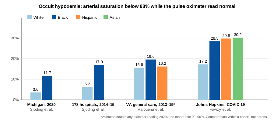
In December 2020, Sjoding and colleagues compared paired readings in two cohorts, meaning two groups of patients (Sjoding et al., 2020). Each pair was a pulse oximeter value and an arterial blood gas drawn within ten minutes of each other. They looked for occult hypoxemia: an arterial saturation below 88 percent, which is low enough to change treatment, while the oximeter read 92 to 96 percent, which is reassuring. In the University of Michigan cohort it occurred in 11.7 percent of Black patients’ readings and 3.6 percent of White patients’. In both cohorts, Black patients had about three times the rate of a dangerously low saturation that the device called normal.
Fawzy and colleagues followed the pattern forward to a decision, in patients with COVID-19 at Johns Hopkins (Fawzy et al., 2022). Occult hypoxemia was more common in Black, Hispanic, and Asian patients than in White patients (Figure 5.2). Then they followed what happened next. Black patients had a 29 percent lower hazard of being recognized as eligible for COVID-19 treatments that depend on an oxygen threshold. (A hazard is roughly the rate at any given moment.) Black patients who were eventually recognized waited a median of one hour longer than White patients. And 451 patients never had their eligibility recognized at all, more than half of them Black. That is how a proxy becomes harm, step by step: a number that looked fine, a treatment threshold never reached on paper, a therapy given late or not at all.
The fix, and its status today. A draft FDA guidance from January 2025 proposes larger oximeter studies across a measured range of skin tones (Lipnick et al., 2025). As of 12 October 2026, the FDA’s page for it still said “Draft. Not for implementation.” A 2025 preprint tested 34 oximeters, and one of the 34 passed the criteria the FDA was expected to adopt (Hughes et al., 2025). The pulse oximeter on your ward tonight was probably cleared under the older 2013 guidance.
This is the case where the bedside answer is encouraging. A saturation that does not match how hard a patient is breathing, how alert he is, or his color is a mismatch any clinician can notice. You do not need to know what photoplethysmography (the light-measurement technique inside the device) is. The blood gas is the check. The difficulty: you have to look at the patient rather than the number, and the number was designed to be looked at.
The sentence for a co-intern: when the number and the patient disagree, believe the patient and get the direct measurement. For this one case, it is also the only fix available to you tonight. Then write the mismatch in the note, with both numbers. The next person covering this patient needs to know that the oximeter reads high on him.
5.3.3 Case two: cost standing in for need
The main case in this chapter is not a device. It is a risk score, and it is the case where there is almost nothing to see at the bedside.
In 2019 Obermeyer and colleagues examined a commercial algorithm used by health systems across the United States (Obermeyer et al., 2019). The algorithm decided which patients should be enrolled in care management programs for high-risk patients: extra nurse contact, help coordinating care. These slots are scarce. Follow it step by step, because each step made sense on its own.
The job. There are far more patients than program slots. Something has to rank them by who would benefit most from extra care.
The measurement problem. “Who would benefit most from extra care” is not a column in any database. Nobody records it. You cannot even define it without knowing what would have happened to the same patient without the program, and that never gets recorded either. So the model’s prediction target, the thing it is trained to predict, became something that is in the database and that plausibly tracks need: future health care costs. Sicker patients cost more. Before reading on, argue for this choice. Cost is objective, recorded for everyone, continuous, and available for every patient without collecting anything new. It is exactly the choice a competent team makes.
The failure. Cost measures health care consumed, not illness. The health system spent less on Black patients than on White patients at the same level of illness. The reasons are the documented ones: less access to care, less intensive treatment, and every other known disparity in what gets spent on whom. The algorithm was accurate at what it predicted and consistently wrong at what it was used for. At the 97th risk percentile, the threshold for automatic enrollment, Black patients had 26 percent more active chronic conditions than White patients with the same score, 4.8 against 3.8.
The fix. The authors did not stop at the finding. They changed what the model predicted, so that it tracked illness rather than cost, and reran the ranking. In the paper’s own words, remedying the disparity “would increase the percentage of Black patients receiving additional help from 17.7 to 46.5%.” One choice of prediction target, made for defensible reasons, had cut this group’s share of the program by a factor of about two and a half.
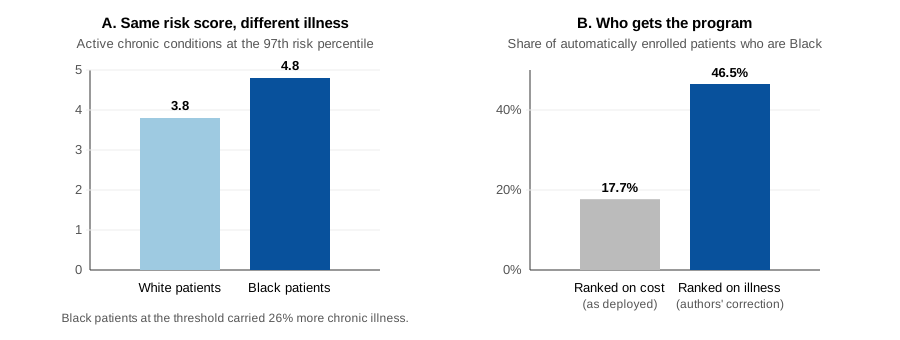
Now ask the bedside question. You are the primary care physician for one of these patients. What would you have seen? Nothing. Your patient was not enrolled in a program, and neither were most of your patients. The harm is defined by a comparison across thousands of patients that no individual clinician ever sees. What would have caught it was not better instinct. It was a count: someone checking, on purpose, who was enrolled and who was not, by group, with the power to act on what they found. That is the difference between this case and the oximeter. It is also why the answer at the end of this chapter has two parts, and why both are needed.
5.3.4 Two pairs of terms you will use all chapter
Statistical bias versus social bias. Statistical bias is how far a model’s output is from the thing it was trained to predict. The Obermeyer algorithm had very little of it; it predicted cost well. Social bias is a mismatch between what was predicted and what should have been predicted. A model can be statistically excellent and socially disastrous at the same time, and often the two goals conflict. When a vendor tells you a model is accurate, you now know which of the two they are talking about.
Harms of allocation versus harms of representation. The terms come from Kate Crawford, in a 2017 talk at the NeurIPS conference (a large machine-learning meeting). An allocation harm is a resource handed out unfairly: a program slot, a transplant listing, a dose of oxygen. A representation harm is a system that carries a demeaning or dismissive picture of a group, whether or not any resource is given or withheld. A model that repeats a debunked claim about Black patients’ pain tolerance has harmed someone before any decision is made. Most of the cases below are allocation harms. At least one is not, and the exercise asks you to decide which.
5.3.5 The cases in one table
These cases are about harm to real patients along racial lines, and some readers will have been harmed by the systems described. The chapter treats each one as an engineering review of a failure: a specific decision, its consequence, and its fix. Whether the harm occurred is not in question in any case here; it is documented. The work is in the mechanism.
Table 5.1 lists the cases this chapter draws on, in the four columns your own row will use in Part B of the Do. The fourth column is the one to read slowly. “Identified” and “fixed” are different claims, and the second needs its own checking.
| Case | What mattered, and what stood in for it | Who was harmed, through what decision | Fix, and its status |
|---|---|---|---|
| Pulse oximetry | Arterial oxygen saturation; light absorbance, calibrated mostly on light skin | Black, Hispanic, and Asian patients; oxygen and COVID-19 treatments delayed or never started (Fawzy et al., 2022; Sjoding et al., 2020) | FDA draft guidance, January 2025. Still draft as of 12 October 2026 (Lipnick et al., 2025) |
| Care management risk score | Health need; predicted health care cost | Black patients; left out of care coordination (Obermeyer et al., 2019) | The authors changed what the model predicts. The paper says the manufacturer confirmed the finding and began working on a fix with them. Other companies’ scores: not known. |
| Kidney function (eGFR) | True kidney filtration; a creatinine formula with a race multiplier | Black patients; later CKD staging and later transplant referral (Vyas et al., 2020) | A national task force recommended the race-free 2021 equation for all US laboratories (Delgado et al., 2021). About two-thirds of US laboratories surveyed had adopted it by March 2023 (Genzen et al., 2023). No later national count was found. |
| Spirometry | Lung function compared with what is expected; an expected value adjusted by race | Black patients; reduced lung function counted as normal, with effects on disability benefits and transplant priority (Bhakta et al., 2023; Diao et al., 2024) | Race-neutral equations were published in 2022 (Bowerman et al., 2023) and recommended by the American Thoracic Society in 2023 (Bhakta et al., 2023). Contested: modeling estimates the switch would reclassify 12.5 million Americans, helping some and costing others (Diao et al., 2024). |
| Dermatology image AI | Disease across all skin tones; training images mostly of light skin | Patients with dark skin; missed or misclassified lesions (Adamson & Smith, 2018; Daneshjou et al., 2022) | Image sets covering all skin tones published; retraining on them closed the gap in one study (Daneshjou et al., 2022). No regulatory requirement for skin-tone reporting. |
| Chest radiograph AI | Disease on the image; labels pulled from the text of old radiology reports | Female, Black, Hispanic, and low-income patients, worst for patients in more than one of these groups; findings called normal (Seyyed-Kalantari et al., 2021) | Documented; no fix adopted at scale. The question is who wrote the labels the model learned from. |
| Large language models | Real physiology; text that repeats race-based medicine | Black patients in particular; debunked claims about kidney function, lung capacity, and pain repeated in clinical answers (Omiye et al., 2023; Zack et al., 2024) | Models change without clear version notes. Re-test with each release. |
Three things to notice across the rows rather than in any one of them.
The proxies were all reasonable. Cost is objective. Devices are calibrated on the volunteers available. Report text is the only label available at radiograph scale. No one in these cases set out to build in inequity. That is why “just don’t be biased” is not a strategy, and asking what the model actually predicts is.
Fixing is slower and messier than finding. Obermeyer is seven years old. The oximeter guidance is still a draft. Race-neutral spirometry is recommended and contested at once. The same equation change that raises Black patients’ disability eligibility lowers White patients’. The two equations predicted respiratory outcomes about equally well, so accuracy does not settle the choice (Diao et al., 2024). “Could not determine the status” is a correct answer in the exercise.
The bedside answers differ sharply by case, and that is the finding. Oximetry has a real bedside sign. Anyone who read the equation could have checked the race-based formulas, and the equation was printed on the lab report the whole time. The chest radiograph model and the care management score are close to undetectable from a single encounter.
5.3.6 The study that complicates the bedside answer
It would be comfortable to leave this chapter believing that a careful clinician catches these. The best evidence says otherwise.
Jabbour and colleagues ran a randomized study with 457 hospitalist physicians, nurse practitioners, and physician assistants (Jabbour et al., 2023). Each read written cases of patients with acute respiratory failure, with chest radiographs. Each then judged whether the cause was pneumonia, heart failure, or COPD. Baseline accuracy was 73.0 percent. A standard AI model raised it by 2.9 points, and by 4.4 points when the model also showed an explanation: a heat map showing where on the radiograph it was looking. A deliberately biased model, one built to be wrong in a consistent direction, lowered accuracy by 11.3 points. Adding explanations to the biased model recovered only 2.3 points, a difference that was not statistically significant. Seeing the model’s reasoning did not protect clinicians from its error.
Individual alertness catches the mismatches that appear in the one patient in front of you. The oximeter case is exactly that, and it is not a small category. It does not catch harms that only appear when you count across many patients. And the evidence says it does not reliably catch a confidently wrong model, even with the reasoning on screen. Institutional auditing by group and personal skepticism are both needed. Neither replaces the other.
5.4 Watch or listen
Podcast. NEJM AI Grand Rounds, “The Double-Edged Sword of AI, with Dr. Ziad Obermeyer” (27 July 2023; 74 min). https://ai-podcast.nejm.org/e/the-double-edged-sword-of-ai-with-dr-ziad-obermeyer/
Optional, and not counted in the chapter’s time. The first author of the cost-for-need paper, interviewed by two physicians who build models. Listen for task formulation, his term for choosing what the model should predict. He argues that this choice, made before any data are used, matters more for bias than anything done afterward. In the second half he describes an algorithm, trained to predict the right target, that reduced a disparity clinicians had been producing. The first 25 minutes cover the main argument. The episode is also on Apple Podcasts, Spotify, and YouTube.
5.5 Do
Made-up patients only. What counts as patient information.
5.5.1 Part A: the worksheet, on the case you already know (15 minutes)
This chapter went through the care management algorithm for you. Now do it on paper, without looking back. Below is what a clinician would actually have seen: a tile in a population-health dashboard, the screen a health system uses to track its patients as a group. It is drawn here to show what was and was not visible.
Copy the worksheet into a document and fill in every line. The word “utilization” on the tile is the only clue the clinician was given. Decide whether it was enough.
Case: Care management risk score (Obermeyer et al. 2019)

1. THE PROXY OR DATA GAP
   What quantity actually mattered, and what measurable thing was
   used in its place?
   ____________________________________________________________________

2. WHO WAS HARMED
   Which population, and through what concrete decision? Name the decision
   that went differently, not just the group.
   ____________________________________________________________________

3. WHAT FIX FOLLOWED
   ____________________________________________________________________

4. ADOPTION STATUS RIGHT NOW
   Finalized / adopted / partial / draft / contested / could not determine.
   Where does your answer come from?
   ____________________________________________________________________

5. THE BEDSIDE QUESTION  (spend the most time here)
   What could a clinician have caught WITHOUT knowing how the algorithm
   works inside? What would you have seen, heard, or measured that did not
   fit? If your honest answer is "nothing," say so and say why.
   ____________________________________________________________________

6. Allocation harm, representation harm, or both? One sentence of defense.
   ____________________________________________________________________

7. Statistical bias, social bias, or both? One sentence.
   ____________________________________________________________________
Questions 1 through 4 are lookups. Question 5 is the exercise. If you wrote a sentence there in under two minutes, go back.
5.5.2 Part B: a case from your specialty, found with AI (30 minutes)
This part is a Learn it with AI step. The chatbot does the first search in seconds. You check one result and turn it into a row of your own.
1. Ask (5 minutes). In ChatGPT Edu, paste this and fill in your specialty:
Name three algorithms in [my specialty] where what is measured differs
from what matters, by race, sex or skin tone; for each, give the paper
and mark it to be verified.
You will usually get three plausible cases, each with a paper and often a sentence that names the stand-in. That is a fast start. Most of a good answer is right; your job is to find out which parts.
2. Check one paper (10 minutes). Pick the case that interests you most. Search its title in PubMed, in quotation marks. If nothing comes up, search the authors and the topic, or run this search and filter to the last five years:
(algorithm OR "artificial intelligence" OR "machine learning" OR "risk score"
 OR "reference equation") AND <your specialty> AND (race OR "skin tone"
 OR "racial bias" OR disparities) AND (bias OR underdiagnosis OR "race-free"
 OR "race-neutral")
Read the abstract. Does the paper exist as the chatbot described it? Does the abstract say what the chatbot said it says? Either answer is worth writing down. What you checked, how, and what you found is question 2 of your learning journal.
3. Write your row (10 minutes). Fill in the Part A worksheet for your case, working from the abstract, not from the chatbot’s summary. Then write your row in the four columns of Table 5.1. Keep the row. List the paper and its PubMed link in question 5 of your journal.
If none of the three cases checks out, or none fits, start from a row of Table 5.1 near your specialty and its cited papers. Dermatology and primary care: dermatology image AI. Nephrology and transplant: eGFR. Pulmonology and surgery: spirometry. Radiology and emergency medicine: chest radiograph AI. Any specialty: large language models.
4. One more question (2 minutes). Ask the chatbot: “What does <the tool from your case> predict, and what is it used to decide?” Compare the answer with your worksheet line 1. Current models often name the stand-in. Check whether yours does, or whether it describes the tool as measuring the thing it was hoped to measure. One sentence in your notes is enough.
5.6 Check
Score yourself against this before moving on.
| You have | Meets | Falls short |
|---|---|---|
| The paper behind your case | You found it in PubMed yourself and can say whether it matched what the chatbot said | Took the chatbot’s citation on trust |
| Worksheet line 1, both cases | Names the quantity that mattered and the thing measured, as two different things | Names the tool, or names one quantity |
| Worksheet line 2, both cases | Names the group and the decision that went differently for them | Names the group only |
| Line 4 | States a status and says where it came from; “could not determine” with a reason counts as meeting | A status with no source, or “fixed” without checking |
| Line 5, the care management case | Says “nothing at a single encounter” and names what would have been needed instead | Claims a bedside sign that does not exist |
| Line 5, your own case | Names a specific sign, or argues specifically why there is none | “Be careful” |
| Lines 6 and 7 | Each label has a one-sentence defense, and you can say which cases are representation harms | Labels without defense |
| The one sentence | You can state the proxy problem without using the word “bias” | “Algorithms can be biased” |
| The second part | You can say what Jabbour et al. found about explanations, and what it means for line 5 | “Clinicians should double-check” |
5.7 What this changes for you
What does this change about how you’ll practice? Write it down before you close this chapter. Two specifics.
First, go back to bed 14. The blood gas is back at 86 percent and the patient is now on high-flow oxygen. Tomorrow on rounds, the attending asks why the oximeter was wrong. Say what it measured and what you hoped it measured, in one sentence, without the word “bias”. Then say whether the patient should be told, and what.
Second, you will use a clinical algorithm in your first month of residency that nobody in this course has heard of. What is the one question you will ask about it? Write your phrasing, not the chapter’s. It fits question 4 of your journal, and it is worth bringing to your Friday group.
5.8 Go deeper
Papers
- The main case in full, with the analysis of other prediction targets (Obermeyer et al., 2019): a fix that changes the question rather than the model.
- The catalog of race-adjusted algorithms, across cardiology, nephrology, obstetrics, urology, and pulmonology (Vyas et al., 2020).
- The spirometry debate: the ATS statement (Bhakta et al., 2023) and the modeling of who is reclassified (Diao et al., 2024), a fix whose costs and benefits go to different people.
- The oximeter regulatory story: the JAMA viewpoint on the draft guidance (Lipnick et al., 2025) and the 34-device test against it (Hughes et al., 2025).
- Clinicians and biased models, with explanations (Jabbour et al., 2023). The supplementary material shows the heat maps the participants saw.
- Where the dermatology gap comes from and how it closes with data (Daneshjou et al., 2022).
- The language-model cases (Omiye et al., 2023; Zack et al., 2024). Re-run their prompts on this year’s model; the answers change.
Talks
- Fairness in machine learning for healthcare, the deck this chapter was adapted from. It covers the technical fixes this chapter leaves out, such as setting different cut-offs for different groups. None of them would have fixed the main case, because its prediction target was wrong.
- AI and ML in an oncology service line for the institutional part of the answer: who audits, who monitors, and what “incorporate biography” means when race is standing in for exposure.
- Kate Crawford, “The Trouble with Bias”, NeurIPS 2017 keynote, the source of the allocation-versus-representation distinction. On YouTube, about 50 minutes: https://www.youtube.com/watch?v=fMym_BKWQzk (a third-party upload; the NeurIPS talk page at https://neurips.cc/virtual/2017/invited-talk/8742 links the official recording on Facebook).